For June’s Colourful theme, we’re taking a look at the work of William Savage, recorded in the University of Wales’ Trinity Saint David’s collections.
The introduction of colour was an important goal from the very beginning of printing in Europe. Johann Fust and Peter Schöffer’s Mainz psalter of 1457 contained red and blue woodcut initials. In Britain, the Schoolmaster Printer’s Boke of Seynt Albans (1486) included coloured illustrations of coats of arms. However, printing in colour was expensive. Although every new printing process led to experiments, the problems of increased cost were never solved. For several centuries, hand-colouring remained the best method for producing images in more than black-and-white.
In the early 19th century, the need to find cheaper ways of producing coloured plates became urgent. Print runs were becoming larger. Books on natural history, archaeology and travel all benefited from coloured illustrations; so too did many maps. Printing, as opposed to hand shading, was a way of ensuring a more or less reliable copy of an image.
William Savage
William Savage (1770-1843) made the earliest 19th century attempts at coloured printing. A native of Howden, in East Yorkshire, he moved to London in 1797. Becoming printer to the Royal Institution, founded in 1799 to teach science and introduce new technologies to the general public, he quickly established a reputation as one of the best printers active in London. Particularly aware of the importance of using good quality ink, he carried out a series of experiments to produce coloured inks that would work well for woodcut illustrations. He replaced oil with copaiba balsam, a resin similar to turpentine tapped from Copaifera trees in South America. Copaiba needed only a short time for preparation; it did not sink into paper and pigment could be added to it without heating.

Practical hints on decorative printing
In 1815 Savage announced his intention to use his inks to publish a book on printing in colours. It was to be sold by subscription, with 325 copies printed (one hundred of these on large paper). The first volume of Practical hints on decorative printing was issued in 1818. In it Savage wrote about the origins of printing, before giving a guide to printing equipment and materials, including the shades used in colour wood-engravings. His text was followed by a series of specimen plates, illustrating the processes used to produce illustrations. In monochrome wood engraving, the craftsman or woman had used a burin to cut relief images against the grain of a hard wood block. Now Savage used multiple blocks to create colour images, often using one block per colour. There were two particular difficulties; first, he had to split an existing coloured image into a series of separate workings, each representing one colour. Then, he needed to register the colours accurately, so they were printed in exactly the right place on the paper.
Neutrals and colours


Some of the plates in Savage’s book are similar to chiaroscuro prints, with only neutral tones used. He included his illustration of the ‘female street sweeper and child’ in all the successive stages of its printing. He wrote:
‘I have given impressions from the blocks separately, and combined, to show the process of printing with a suite of blocks; and this number will show the principle as well as if there had been more. It is printed with an ink composed of rose pink, chrome yellow, and black. The middle tint was first printed, then the deepest, and lastly the lightest.’

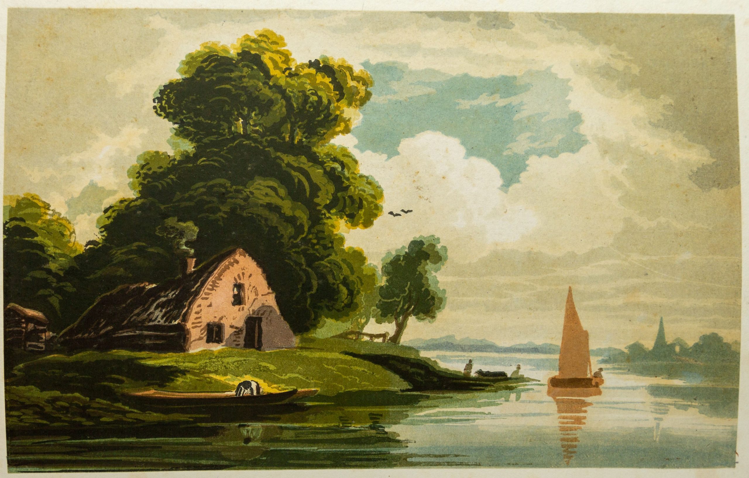
For some other plates, Savage employed many different colours. His illustration of an antique vase used seven wood blocks in different colours and his plate of a cottage and landscape in colours, ten. He wrote of the picture of the cottage, ‘It commenced with printing the clouds, which are the Neutral Tint; then the blue sky, with Antwerpt Blue, and advanced progressively to the darkest shades: the trees were glazed with green after the deepest parts were printed.’ Savage also included six more plates illustrating eighteen examples of his inks.

Savage published the second part of his book (not in UWTSD stock) five years later in 1823. In 1825, the Society of Arts awarded him a silver medal and £15 15s for his colour printing. He went on to publish On the preparation of printing in 1832 and A Dictionary of the art of printing in 1840-41. He died at his home in Kensington on 25 July 1843.
Further information
Written by Ruth Gooding, Special Collections Librarian at University of Wales Trinity Saint David.
Edited by Isabel Lauterjung, Blog Coordinator with Explore Your Archive.
To find out more about UoWTSD: Special Collections and Archives | University of Wales Trinity Saint David